A retro-style Split Flap display panel for Grafana.
It brings the classic mechanical look of airport departure boards (Solari boards) to your dashboards. I built this to offer a high-quality, animated visualization that feels "real"—with proper physics for the flaps and smooth animations. Perfect for status boards, KPIs, or just making your dashboard look awesome.
Turn your dashboard into a stylish world clock.
- Standalone: Does not require any data source.
- Timezones: Support for all major world timezones (400+ timezones available).
- Formats: 12h/24h options, show/hide seconds.
- Time Separator: Choose between Colon (:), Dot (.), Dash (-), Space ( ), or None.
- Date Format: Optional date display (DD/MM/YYYY, MM/DD/YYYY, YYYY-MM-DD, DD.MM.YYYY).
- Day of Week: Optionally display the current day name (short format).
The flip logic isn't just random:
- Numbers: Flip fast using a numeric-only path (e.g., 1 -> 2 is quick).
- Text: Goes through the full alphabet cycle, just like the real mechanical ones.
- Physics: Long flips accelerate and then slow down at the end (easing).
Comes with a bunch of built-in styles so you don't have to write CSS:
| Theme | Description | Best For |
|---|---|---|
| Classic | Standard dark grey, flat look. | General use |
| Classic 3D | Like Classic but with more depth and shadows. | Realistic look |
| Aviation: Departure | Classic airport board style with yellow text on black. | Flight departure boards |
| Aviation: Cockpit | Technical instrument style with cyan text. | Aircraft cockpits |
| Aviation: Tarmac | Orange/amber high-visibility style. | Ground operations |
| Swiss SBB: Black | Swiss railway black display style. | Transportation |
| Swiss SBB: White | Swiss railway white display style. | Transportation |
| Swiss SBB: Blue | Swiss railway blue with red border. | Transportation |
| Airport | Gold text on black background. | Flight boards |
| Mechanical | White/Metal industrial style. | IoT / Machinery |
| Cyberpunk | Neon cyan with CRT scanlines. | Sci-fi dashboards |
| Matrix | Actual digital rain animation in the background. | Hacker vibes |
| Neon | Dark background with heavy text glow. | Night mode |
| E-Ink | High contrast, paper-like with vignette. | E-readers look |
| Glass | Frosted glass effect with transparency. | Modern UI |
| Blue Glass | Blue-tinted glass effect. | Modern UI |
| Rainbow | Colorful gradient display. | Colorful dashboards |
| Newspaper | Halftone newspaper print style. | Vintage look |
| iOS Light | Apple iOS light mode style. | Modern Apple-style UI |
| iOS Dark | Apple iOS dark mode style. | Modern Apple-style UI |
| Wood | Wooden texture style. | Natural/organic look |
| Red 3D | Red 3D gradient style. | Alerts / Warnings |
| Option | What it does |
|---|---|
| Value Aggregation | Pick what to show from the series: Last, First, Min, Max, Mean, Sum, Count, etc. |
| Main Content | Choose what goes on the flaps: Value, Name, Name + Value, or Value + Name. |
| Auto Fit | Automatically calculates the best card size to fit the panel. Turn off for fixed size. |
| Name Position | Position of series name: Top, Bottom, Left, or Right. |
| Name Alignment | Alignment of series name: Start, Center, or End. |
| Name Font Size | Custom font size for series name (8-100px). |
| Unit Position | Position of unit: Top, Bottom, Left, Right, or None. |
| Unit Alignment | Alignment of unit: Start, Center, or End. |
| Unit Rotation | Rotate unit text 90 degrees. |
| Custom Unit | Override the unit with custom text. |
| Unit Font Size | Custom font size for unit (8-100px). |
See the panel in action with different configurations:
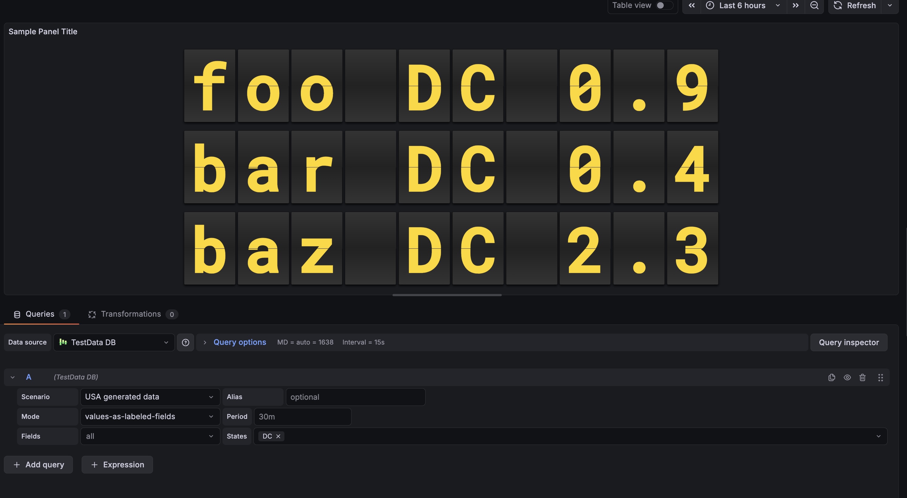 Shows numeric values with the classic airport look.
- Add it: Find "Split Flap" in the visualization list.
- Choose Mode:
- Data Series: Connect a data source to visualize metrics.
- Clock: Display current time for any timezone (no data source needed).
- Tweak it:
- Change layout (Vertical/Horizontal).
- Pick a theme that fits your dashboard.
- Set up Thresholds to change colors dynamically (e.g., red when value > 80).
| Setting | Description | Default |
|---|---|---|
| Mode | Choose between Data Series or Clock. |
Data Series |
| Layout | Direction of the series grid (Horizontal / Vertical). | Horizontal |
| Show Separators | Draw lines between different series. | Off |
| Theme | Visual style of the flaps (see Themes section above). | Classic |
| Show Name | Display series name outside the flaps. | On |
| Name Position | Where to place the name: Top, Bottom, Left, or Right. | Top |
| Name Alignment | How to align the name: Start, Center, or End. | Center |
| Name Font Size | Font size for the name (8-100px). | 18 |
| Show Unit | Display unit outside the flaps. | On |
| Unit Position | Where to place the unit: Top, Bottom, Left, Right, or None. | Right |
| Unit Alignment | How to align the unit: Start, Center, or End. | Center |
| Unit Rotation | Rotate unit text 90 degrees. | Off |
| Custom Unit | Override the unit with custom text. | (empty) |
| Unit Font Size | Font size for the unit (8-100px). | 24 |
| Threshold Target | What to colorize: Text, Tile (card background), or Panel background. | None |
| Setting | Description | Default |
|---|---|---|
| 12-Hour Format | Use 12-hour format (AM/PM) instead of 24-hour. | Off |
| Show Seconds | Display seconds in the time. | On |
| Timezone | Select timezone (400+ available) or use browser local time. | Browser Local |
| Show Timezone | Display timezone name (e.g., "EST", "PST", "UTC") outside the clock. | Off |
| Timezone Position | Where to place the timezone: Top, Bottom, Left, or Right. | Bottom |
| Timezone Alignment | How to align the timezone: Start, Center, or End. | Center |
| Timezone Font Size | Font size for the timezone (8-100px). | 18 |
| Time Separator | Character between hours, minutes, seconds: Colon (:), Dot (.), Dash (-), Space ( ), or None. | Colon |
| Date Format | Optional date display format: DD/MM/YYYY, MM/DD/YYYY, YYYY-MM-DD, DD.MM.YYYY, or None. | None |
| Show Day of Week | Display abbreviated day name (Mon, Tue, etc.). | Off |
| AM/PM Position | Position of AM/PM indicator: In Text (Default), Left, or Right. | In Text |
| AM/PM Orientation | Orientation of AM/PM: Horizontal or Vertical. | Horizontal |
| AM/PM Font Size | Font size for AM/PM indicator. | 18 |
| AM/PM Gap | Spacing between AM/PM and the clock digits. | 12 |
| Setting | Description | Default |
|---|---|---|
| Digits | Minimum number of characters/cards to show. | 6 |
| Rounding | Decimal places for numbers. | 1 |
| Auto Fit | Auto-scale card size to fill the panel. | On |
| Size (px) | Fixed card height (if Auto Fit is off). | 50 |
| Gap | Space between individual cards. | 4 |
| Speed | Animation speed multiplier (0.1-2.0). | 0.49 |
| Fast Speed | Speed for quick number transitions (0.05-0.5). | 0.1 |
- Grab the latest release zip.
- Unzip it into your Grafana plugins folder (usually
/var/lib/grafana/plugins). - Restart Grafana.
npm installnpm run devnpm run build