
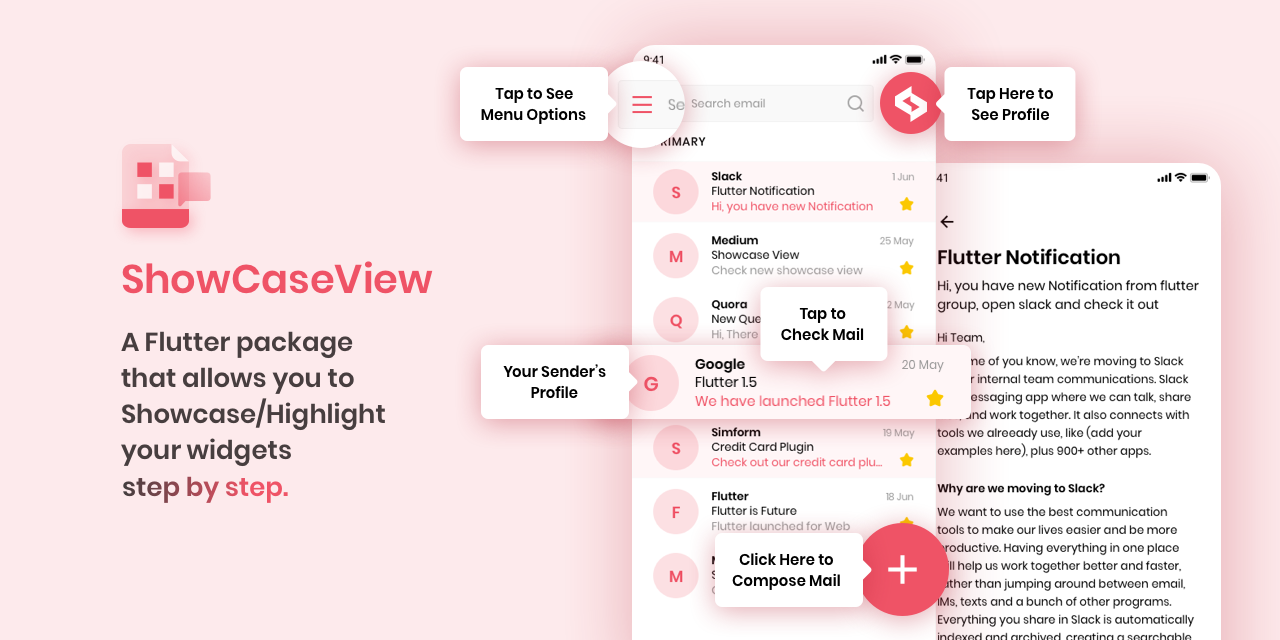
A Flutter package allows you to Showcase/Highlight your widgets.
Check out other amazing open-source Flutter libraries and Mobile libraries developed by Simform Solutions!
Renamed parameters titleAlignment to titleTextAlign and descriptionAlignment
to descriptionTextAlign to correspond it more with the TextAlign property.titleAlignment
and descriptionAlignment will be used for widget alignment.
Before:
Showcase(
  titleAlignment: TextAlign.center,
  descriptionAlignment: TextAlign.center,
),
After:
Showcase(
  titleTextAlign: TextAlign.center,
  descriptionTextAlign: TextAlign.center,
),-
Add dependency to
pubspec.yamlGet the latest version in the 'Installing' tab on pub.dev
dependencies:
showcaseview: <latest-version>- Import the package
import 'package:showcaseview/showcaseview.dart';- Register a
ShowCaseViewwidget.
  void initState() {
  super.initState();
  ShowcaseView.register(scope: scopeName);
);- Adding a
Showcasewidget.
GlobalKey _one = GlobalKey();
GlobalKey _two = GlobalKey();
GlobalKey _three = GlobalKey();

...

Showcase(
  key: _one,
  title: 'Menu',
  description: 'Click here to see menu options',
  child: Icon(
    Icons.menu,
    color: Colors.black45,
  ),
),

Showcase.withWidget(
  key: _three,
  height: 80,
  width: 140,
  targetShapeBorder: CircleBorder(),
  container: Column(
    crossAxisAlignment: CrossAxisAlignment.start,
    children: <Widget>[
      ...
    ],
  ),
  child: ...,
),- Starting the
ShowCase:
- If you have a single showcase, then you can start the
ShowCaseViewusing the code below:
someEvent() {
  ShowCaseView.get().startShowCase([_one, _two, _three]);
}- If you have multiple ShowcaseViews, then you can start the
ShowCaseViewusing the code below, which is recommended:
someEvent() {
  ShowCaseView.getNamed(scopeName).startShowCase([_one, _two, _three]);
}
If you want to start the ShowCaseView as soon as your UI built up then use below code:
WidgetsBinding.instance.addPostFrameCallback((_) =>
  ShowCaseWidget.of(context).startShowCase([_one, _two, _three])
);
If you have some animation or transition in your UI and you want to start the ShowCaseView after
that then use below code:
WidgetsBinding.instance.addPostFrameCallback((_) =>
  ShowCaseWidget.of(context).startShowCase([_one, _two, _three], delay: "Animation Duration")
);Check out the example app in the example directory or the 'Example' tab on pub.dartlang.org for a more complete example.
To show multiple showcase at the same time provide same key to showcase. Note: auto scroll to showcase will not work in case of the multi-showcase and we will use property of first initialized showcase for common things like barrier tap and colors.
GlobalKey _one = GlobalKey();
...

Showcase
  (
    key: _one,
    title: 'Showcase one',
    description: 'Click here to see menu options',
    child: Icon(
    Icons.menu,
    color: Colors.black45,
  ),
),

Showcase(
  key: _one,
  title: 'Showcase two',
  description: 'Click here to see menu options',
  child: Icon(
  Icons.menu,
  color:Colors.black45,
  ),
),Auto Scrolling to active showcase feature will not work properly in scroll views that renders widgets on demand(ex, ListView, GridView).
In order to scroll to a widget it needs to be attached with widget tree. So, If you are using a scrollview that renders widgets on demand, it is possible that the widget on which showcase is applied is not attached in widget tree. So, flutter won't be able to scroll to that widget.
So, If you want to make a scroll view that contains less number of children widget then prefer to use SingleChildScrollView.
If using SingleChildScrollView is not an option, then you can assign a ScrollController to that scrollview and manually scroll to the position where showcase widget gets rendered. You can add that code in onStart method of ShowCaseWidget.
Example:
// This controller will be assigned to respected sctollview.
final _controller = ScrollController();

ShowCaseView.register
(
  onStart: (index, key) {
    if(index == 0) {
      WidgetsBinding.instance.addPostFrameCallback((_) {
       // If showcase widget is at offset 1000 in the listview.
       // If you don't know the exact position of the showcase widget,
       // You can provide nearest possible location.
       //
       // In this case providing 990 instead of 1000 will work as well.
        _controller.jumpTo(1000);
      });
    }
  },
);You can create a custom showcase widget using Showcase.withWidget:
Showcase.withWidget
(
  key: _customKey,
  height: 80,
  width: 140,
  targetShapeBorder: CircleBorder(),
  container: Column(
    crossAxisAlignment: CrossAxisAlignment.start,
    children: <Widget>[
      Text("This is a custom widget!", style: TextStyle(color: Colors.white)),
      SizedBox(height: 10),
      Text("You can add any content here.", style: TextStyle(color: Colors.white)),
    ],
  ),
  child: FloatingActionButton(
  onPressed: () {},
  child: Icon(Icons.add),
  ),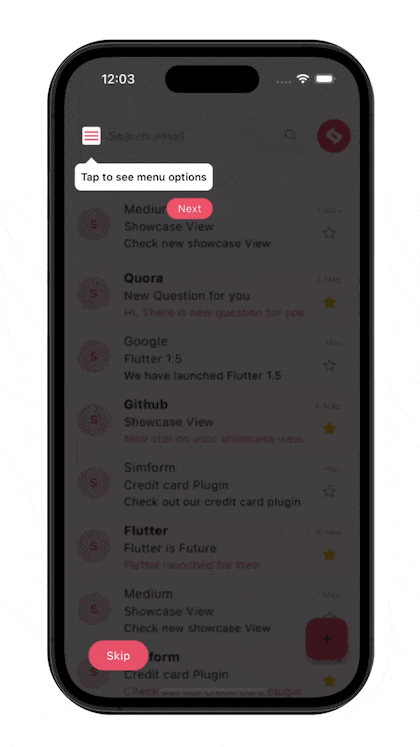
)You can add action buttons to your tooltips to enhance user interaction:
Showcase
(
key: _actionKey,
title: 'Profile',
description: 'Tap to view your profile',
tooltipActions: [
TooltipActionButton(
type: TooltipActionButtonType.next,
name: 'NEXT',
onTap: () {
// Custom action when next is pressed
print("Next pressed");
},
),
TooltipActionButton(
type: TooltipActionButtonType.skip,
name: 'SKIP',
),
],
tooltipActionConfig: TooltipActionConfig(
position: TooltipActionPosition.outside,
alignment: MainAxisAlignment.center,
),
child: CircleAvatar(
child: Icon(Icons.person)
,
)
,
)Create custom action buttons with TooltipActionButton.custom:
Showcase
(
key: _customActionKey,
title: 'Custom Actions',
description: 'This showcase has custom action buttons',
tooltipActions: [
TooltipActionButton.custom(
button: Container(
padding: EdgeInsets.symmetric(horizontal: 10, vertical: 4),
decoration: BoxDecoration(
color: Colors.blue,
borderRadius: BorderRadius.circular(8),
),
child: Row(
children: [
Icon(Icons.arrow_forward, color: Colors.white, size: 18),
SizedBox(width: 5),
Text('Continue', style: TextStyle(color: Colors.white)),
],
),
),
onTap: () {
// Custom action
},
),
],
child: ListTile(
leading: Icon(Icons.star),
title: Text('Featured Item'),
),
)Add a floating action widget that appears during the showcase:
Showcase
(
key: _floatingKey,
title: 'Swipe Gesture',
description: 'Swipe left or right to navigate',
floatingActionWidget: (context) => Container(
width: 200,
height: 100,
padding: EdgeInsets.all(10),
margin: EdgeInsets.only(bottom: 50),
decoration: BoxDecoration(
color: Colors.white,
borderRadius: BorderRadius.circular(10),
boxShadow: [
BoxShadow(color: Colors.black26, blurRadius: 10, offset: Offset(0, 5))
],
),
child: Column(
children: [
Icon(Icons.swipe, size: 40),
Text('Swipe to continue', style: TextStyle(fontWeight: FontWeight.bold)),
Text('Use your finger to navigate between items'),
],
),
),
child: Card(
child: ListTile(
title: Text('Swipeable Item'),
subtitle: Text('Try swiping this item'
)
,
)
,
)
,
)| Function Name | Description |
|---|---|
| startShowCase | Starting the showcase |
| next | Starts next showcase |
| previous | Starts previous showcase |
| dismiss | Dismisses all showcases |
| unRegister | UnRegister all showcases and the showcaseView scope |
 Sahil Totala |
 Vatsal Tanna |
 Sanket Kachhela |
 Happy Makadiya |
 Ujas Majithiya |
 Aditya Chavda |
MIT License

Copyright (c) 2021 Simform Solutions

Permission is hereby granted, free of charge, to any person obtaining a copy
of this software and associated documentation files (the "Software"), to deal
in the Software without restriction, including without limitation the rights
to use, copy, modify, merge, publish, distribute, sublicense, and/or sell
copies of the Software, and to permit persons to whom the Software is
furnished to do so, subject to the following conditions:

The above copyright notice and this permission notice shall be included in all
copies or substantial portions of the Software.

THE SOFTWARE IS PROVIDED "AS IS", WITHOUT WARRANTY OF ANY KIND, EXPRESS OR
IMPLIED, INCLUDING BUT NOT LIMITED TO THE WARRANTIES OF MERCHANTABILITY,
FITNESS FOR A PARTICULAR PURPOSE AND NONINFRINGEMENT. IN NO EVENT SHALL THE
AUTHORS OR COPYRIGHT HOLDERS BE LIABLE FOR ANY CLAIM, DAMAGES OR OTHER
LIABILITY, WHETHER IN AN ACTION OF CONTRACT, TORT OR OTHERWISE, ARISING FROM,
OUT OF OR IN CONNECTION WITH THE SOFTWARE OR THE USE OR OTHER DEALINGS IN THE
SOFTWARE.