Note: This issue was researched and written by an AI assistant (Claude Code) on my behalf, and verified against a live self-hosted instance. — @jrbromberg
Describe the bug
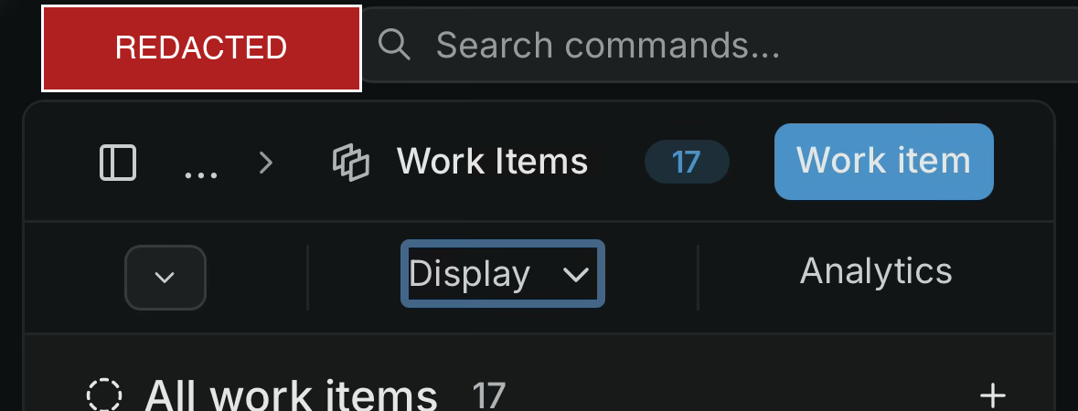
On mobile (iOS, WebKit), the top bar of a project's Work Items view is not responsive. The workspace switcher + "Search commands…" field + the Work Items / Display / Analytics controls render at desktop widths and overflow horizontally past the viewport instead of collapsing into a mobile layout. The search field and right-side controls are cut off / require horizontal scrolling.
The issue list content itself loads and renders fine — this is specifically the header/top-bar layout on narrow screens.
Steps to reproduce
- Self-host Plane CE v1.3.1.
- Open a project's Work Items (issues) view in a mobile browser (iOS Safari/Chrome, ~390px wide).
- Observe the top bar overflowing horizontally; controls extend beyond the screen edge.
Expected behavior
The header/top bar collapses responsively on narrow viewports (e.g. condensed controls or an overflow menu), staying within the viewport width.
Environment
- Plane: self-hosted Community Edition v1.3.1 (Docker Compose)
- Device/browser: iPhone, iOS 26 (WebKit — both Safari and iOS Chrome)
- Accessed over the network via a browser (not the native app)
Screenshot
Mobile view of the Work Items top bar — the "Search commands…" field and the Work Items / Display / Analytics controls overflow the ~390px viewport instead of collapsing.
Describe the bug
On mobile (iOS, WebKit), the top bar of a project's Work Items view is not responsive. The workspace switcher + "Search commands…" field + the
Work Items / Display / Analyticscontrols render at desktop widths and overflow horizontally past the viewport instead of collapsing into a mobile layout. The search field and right-side controls are cut off / require horizontal scrolling.The issue list content itself loads and renders fine — this is specifically the header/top-bar layout on narrow screens.
Steps to reproduce
Expected behavior
The header/top bar collapses responsively on narrow viewports (e.g. condensed controls or an overflow menu), staying within the viewport width.
Environment
Screenshot
Mobile view of the Work Items top bar — the "Search commands…" field and the
Work Items / Display / Analyticscontrols overflow the ~390px viewport instead of collapsing.