| description |
|---|
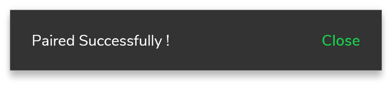
GF Flutter Toast is a Flutter Toast Widget that can be used to display quick warning or error messages for a short time period. You can customize it as required. |
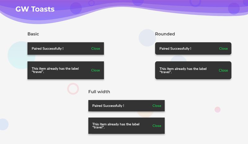
GFToast is a Flutter Toast that is used to show toast messages or errors in a given interval of time and it can have trailing widgets to display icons or buttons.
The simple example code for Flutter Toast Widget is shown below.
import 'package:getwidget/getwidget.dart';

            GestureDetector(
              onTap: () => GFToast.showToast(
                'GetFlutter is an open source library that comes with pre-build 1000+ UI components.',
                context,
              ),
              child: Container(
                margin: const EdgeInsets.only(left: 15, right: 15, top: 20),
                padding: const EdgeInsets.all(5),
                decoration: BoxDecoration(
                    borderRadius: const BorderRadius.all(Radius.circular(7)),
                    color: GFColors.DARK,
                    boxShadow: [
                      BoxShadow(
                          color: Colors.black.withOpacity(0.40), blurRadius: 5)
                    ]),
                child: GFListTile(
                    color: GFColors.DARK,
                    title: const Text(
                      'Show Toast',
                      style: TextStyle(color: GFColors.WHITE),
                    ),
                    icon: Icon(
                      CupertinoIcons.forward,
                      color: GFColors.SUCCESS,
                    )),
)),GFToast can be used to dismiss or cancel messages or warnings with the help of a GFButton inside the GFToast. Hence GFToast will be usually accompanied by a Flutter button.
The below example shows a simple code of how the Flutter button is used with the GFToast.
import 'package:getwidget/getwidget.dart';

           GestureDetector(
              onTap: () => GFToast.showToast(
                  'GetFlutter is an open source library that comes with pre-build 1000+ UI components.',
                  context,
                  toastPosition: GFToastPosition.BOTTOM,
                  textStyle: TextStyle(fontSize: 16, color: GFColors.DARK),
                  backgroundColor: GFColors.LIGHT,
                  trailing: Icon(
                    Icons.notifications,
                    color: GFColors.SUCCESS,
                  )),
              child: Container(
                margin: const EdgeInsets.only(left: 15, right: 15, top: 20),
                padding: const EdgeInsets.all(5),
                decoration: BoxDecoration(
                    borderRadius: const BorderRadius.all(Radius.circular(7)),
                    color: GFColors.DARK,
                    boxShadow: [
                      BoxShadow(
                          color: Colors.black.withOpacity(0.40), blurRadius: 5)
                    ]),
                child: GFListTile(
                    color: GFColors.DARK,
                    title: const Text(
                      'Show Toast with trailing',
                      style: TextStyle(color: GFColors.WHITE),
                    ),
                    icon: Icon(
                      CupertinoIcons.forward,
                      color: GFColors.SUCCESS,
                    )),
)),Toasts can be positioned accordingly over viewing screen. The positioning can be done using GFToastPosition.BOTTOM. The usage of these is shown below.
import 'package:getwidget/getwidget.dart';

            GestureDetector(
              onTap: () => GFToast.showToast(
                'GetFlutter is an open source library that comes with pre-build 1000+ UI components.',
                context,
                toastPosition: GFToastPosition.BOTTOM,
              ),
              child: Container(
                margin: const EdgeInsets.only(left: 15, right: 15, top: 20),
                padding: const EdgeInsets.all(5),
                decoration: BoxDecoration(
                    borderRadius: const BorderRadius.all(Radius.circular(7)),
                    color: GFColors.DARK,
                    boxShadow: [
                      BoxShadow(
                          color: Colors.black.withOpacity(0.40), blurRadius: 5)
                    ]),
                child: GFListTile(
                    color: GFColors.DARK,
                    title: const Text(
                      'Show Toast with toast position',
                      style: TextStyle(color: GFColors.WHITE),
                    ),
                    icon: Icon(
                      CupertinoIcons.forward,
                      color: GFColors.SUCCESS,
                    )),
)),GFToast can be customized for a better look and feel. Here are the properties:
| Name | Description |
|---|---|
| text | text of type [String] display on toast |
| backgroundColor | defines the background color of the toast |
| textStyle | defines the test style of the toast text |
| toastBorderRadius | defines the border radius of the toast |
| border | defines the border of the toast |
| toastPosition | defines the position of toast over the screen |
| toastDuration | defines the duration of time toast display over screen |
| trailing | defines the trailing widget of the toast |