| description |
|---|
GF Flutter Carousel widget custom develop Carousel widget that has the option to use with image, text, Dot indicator, background image, fullscreen properties to customize. |
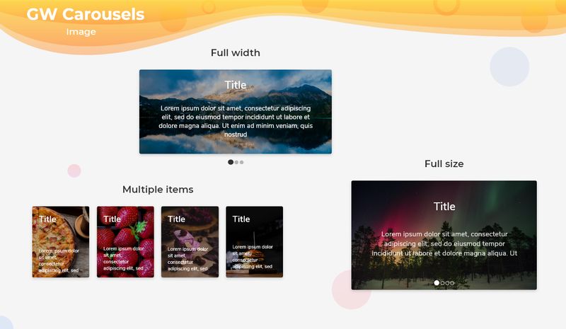
GFCarousel is a Flutter Carousel or Flutter Image Slider widget that has a set of images that slides one after the other in a linear manner repeatedly in a given interval of time. GFCarousel can have any number of items in a slide and it can also have multiple images in one single slide.

Below is a simple example code for Flutter Carousel with indicator of one image in one slide of GFCarousel
import 'package:getwidget/getwidget.dart';

final List<String> imageList = [
  "https://cdn.pixabay.com/photo/2017/12/03/18/04/christmas-balls-2995437_960_720.jpg",
  "https://cdn.pixabay.com/photo/2017/12/13/00/23/christmas-3015776_960_720.jpg",
  "https://cdn.pixabay.com/photo/2019/12/19/10/55/christmas-market-4705877_960_720.jpg",
  "https://cdn.pixabay.com/photo/2019/12/20/00/03/road-4707345_960_720.jpg",
  "https://cdn.pixabay.com/photo/2019/12/22/04/18/x-mas-4711785__340.jpg",
  "https://cdn.pixabay.com/photo/2016/11/22/07/09/spruce-1848543__340.jpg"
];

 GFCarousel(
    items: imageList.map(
     (url) {
     return Container(
       margin: EdgeInsets.all(8.0),
       child: ClipRRect(
         borderRadius: BorderRadius.all(Radius.circular(5.0)),
          child: Image.network(
             url,
             fit: BoxFit.cover,
              width: 1000.0
           ),
        ),
      );
      },
     ).toList(),
    onPageChanged: (index) {
      setState(() {
        index;
      });
    },
),The look and feel of the GF carousel widget for the Flutter app can be customized using the GFCarousel properties. Sliding items can be any type of list of widgets or a list of images.
| Name | Description |
|---|---|
| items | widgets to be shown as a slider |
| height | set slide widget height and overrides any existing [aspectRatio] |
| aspectRatio | aspect ratio is used if no height has been declared. Defaults to 16:9 aspect ratio |
| viewportFraction | The fraction of the viewport that each page should occupy. Defaults to 0.8, which means each page fills 80% of the slide |
| autoPlay | enables autoplay, sliding one page at a time. Use [autoPlayInterval] to determent the frequency of slides. Defaults to false works only if viewportFraction set to 1.0, |
| reverse | reverse the order of items if set to true. Defaults to false |
| autoPlayInterval | sets Duration to determent the frequency of slides when [autoPlay] is set to true. Defaults to 4 seconds |
| autoPlayAnimationDuration | animation-duration between two transitioning pages while in auto playback. Defaults to 800 ms |
| autoPlayCurve | determines the animation curve physics. Defaults to [Curves.fastOutSlowIn] |
| enlargeMainPage | determines if the current page should be larger than the side images, creating a feeling of depth in the carousel. Defaults to false |
| pauseAutoPlayOnTouch | sets a timer on touch detected that pauses the autoplay with the given [Duration]. Touch Detection is only active if [autoPlay] is true |
| pagination | displays pagination on state true |
| passiveIndicator | slider pagination's passive color |
| activeIndicator | slider pagination's active color |
| pagerSize | pagination dots size can be defined using [double] |
| initialPage | initial page to show when first creating the [GFCarousel]. Defaults to 0 |
| enableInfiniteScroll | determines if slides should loop infinitely or be limited to item length. Defaults to true, i.e. infinite loop |
| scrollDirection | axis along which the page view scrolls. Defaults to [Axis.horizontal] |
| onPageChanged | called whenever the page in the center of the viewport changes |
GFCarousel can have any number of images and it can also have multiple images in just one slide. It supports multi-image slides. The ItemsCarousel component of GetWidget for the Flutter app is a multi-section container with multiple items. Each section can be swiped or dragged between. It contains any number of items in each Slide component.

In the below code, the list of Images given to the children in the GFItemsCarousel, that allows sliding each slide container that contains multiple items.
The below code gives the default Flutter multi-image slider component
import 'package:getwidget/getwidget.dart';

final List<String> imageList = [
  "https://cdn.pixabay.com/photo/2017/12/03/18/04/christmas-balls-2995437_960_720.jpg",
  "https://cdn.pixabay.com/photo/2017/12/13/00/23/christmas-3015776_960_720.jpg",
  "https://cdn.pixabay.com/photo/2019/12/19/10/55/christmas-market-4705877_960_720.jpg",
  "https://cdn.pixabay.com/photo/2019/12/20/00/03/road-4707345_960_720.jpg",
  "https://cdn.pixabay.com/photo/2019/12/22/04/18/x-mas-4711785__340.jpg",
  "https://cdn.pixabay.com/photo/2016/11/22/07/09/spruce-1848543__340.jpg"
];

 GFItemsCarousel(
   rowCount: 3,
   children: imageList.map(
     (url) {
      return Container(
        margin: EdgeInsets.all(5.0),
        child: ClipRRect(
        borderRadius: BorderRadius.all(Radius.circular(5.0)),
        child:
          Image.network(url, fit: BoxFit.cover, width: 1000.0),
         ),
      );
     },
   ).toList(),
),| Name | Description |
|---|---|
| rowCount | count of visible cells in each slide |
| children | widgets to be shown in slides |
| itemHeight | defines the height of an item |